(650) 766-1883
Email Us

The EpicOncology™ platform contains several distinct features: Epic Analyses, Epic Flow Diagrams, Physician Surveys, Insights, and References. Each feature provides a critical component for working with our cancer data sets.
Your EpicOncology™ subscription grants you full access to all these features, all within an interface built for universal ease of use.
According to our customers, we succeeded:
I know I keep saying this, but your interface is head and tails above the rest. It’s so easy to use!
Let’s explore how the Epic platform integrates into your cancer epidemiology research.
As you can see, the Epic interface presents the data front and center. Option selectors make it easy to modify your view. Store your queries and data selections for future access.
Epic also helps you learn to use it, through version release notes, FAQs, guides, and training videos.
The centerpiece of EpicOncology™—our source for advanced patient flow models. Epic Analyses provides the cancer epidemiology data you’re looking for. Rigorously checked. Fully sourced.
The Epic Analyses feature gives you detailed data tables with interactive graphs, all of which you can filter by stage, subtype, gender, and age group.
Source and examine epidemiology statistics by stage or subtype for the years 2010 to 2040. At all times, you can identify the current year by its gray highlight.
Epic Analyses includes interactive graphs, rate calculations, an ‘Export to Excel’ feature, and links to sources, assumptions, and other Epic Features.
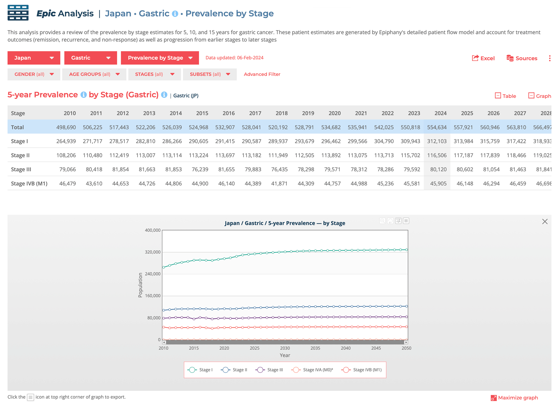
To demonstrate how thorough EpicOncology™ is, here’s a list of all data analyses available to you. These details are current as of Q2 2024.*
We group the epidemiology statistics into 5 organizational categories:
*Please note: Not all analyses are available for all cancer sites. Certain epidemiology statistics will vary by site.
Epic Flow Diagrams give you graphical presentations of complex data sets. Clarifying the data in visual diagrams often makes comprehending the data much easier. You can also generate new insights at a glance, given how the data relations display within the diagram.
Generate simple or detailed flow diagrams, based on how the different statistics are related and how patients move through Epiphany’s flow models.
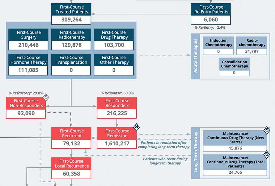
Overviews of Epiphany’s patient flow model, untreated pools, treated patients, modalities, response, remission, relapse, and progression (as appropriate).
Utility: Perspectives on how statistic related to each other and how patients move through treatment across courses of treatment.
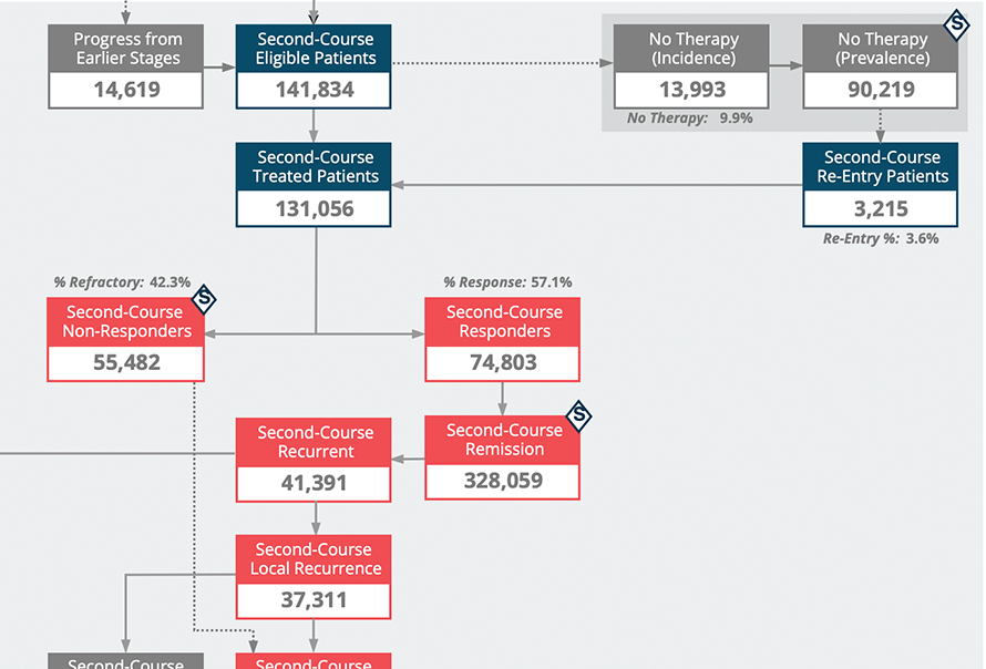
Provides the same data as the detailed flow, excluding the specific modalities.
Utility: Perspectives on patient movement through the flow model across courses of treatment.
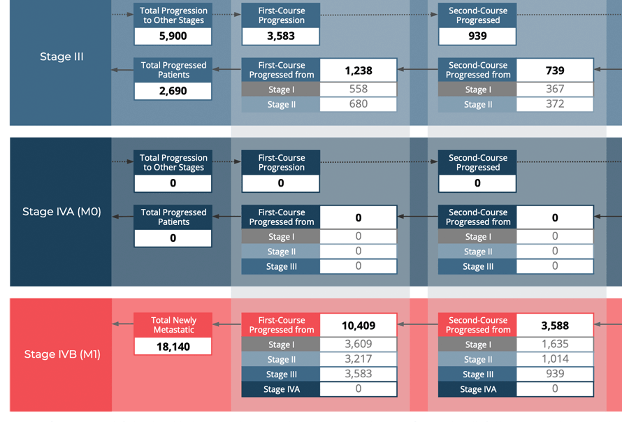
Illustrates the number of patients who progress from earlier stages to later stages. For example, from Stage I to Stage II, from Stages I and II to Stage III, or from Stages I, II, and III to Stage IV (metastatic).
Utility: Understand the size of the progressive pool of patients and the number of progressive patients that move to each subsequent stage.
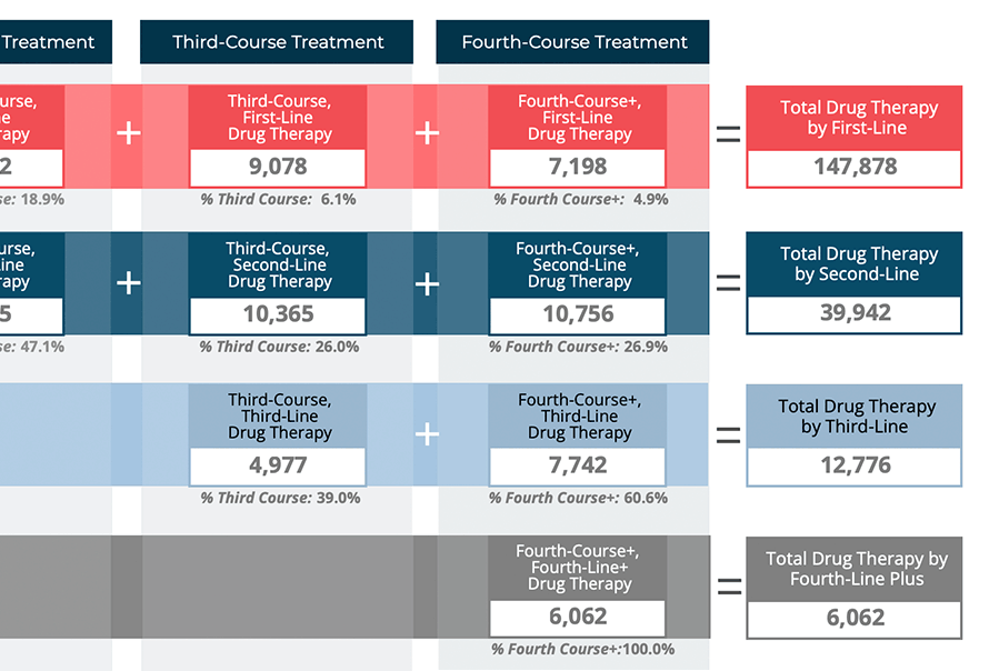
Illustrates how drug or hormone use (first-, second-, third-, and fourth-line plus) may vary across courses of treatment.
Utility: Understand how course of treatment splits each line of drug or hormone therapy, providing insight into modality utilization across courses.
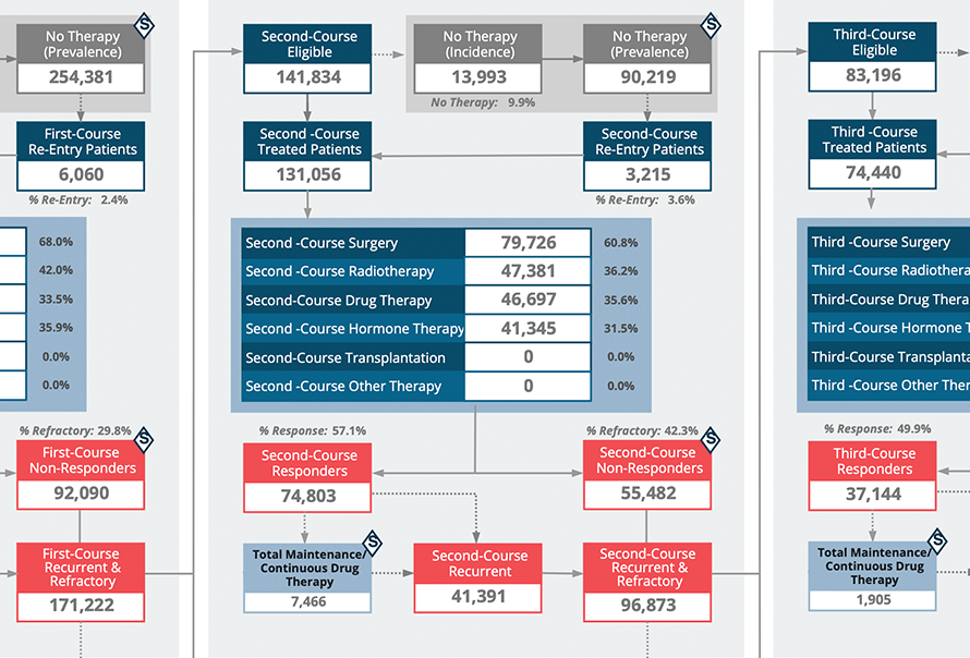
Provides perspective on how different treatment modalities are utilized across courses of treatment, including response, remission, and relapse.
Utility: Understand how the treatment modality use shifts across course of therapy, including relapse and progression (as appropriate). Generate multiple diagrams within Epic Flow, download, and paste directly into your internal documents.
Build your own queries just like a spreadsheet. A spreadsheet with the world’s most detailed cancer data set as its source.
‘Slice’ the data down as granularly as you want. Need the Third-Course treatment for juvenile esophageal cancer in South America from 2010-2012? One Advanced Query will tell you the exact results.
Make as many Advanced Queries as you need. Save them for future reference.
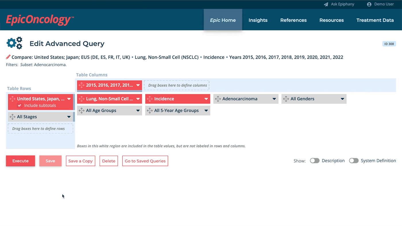
Utilize this powerful drag-and-drop feature for creating 3-dimensional datasets.
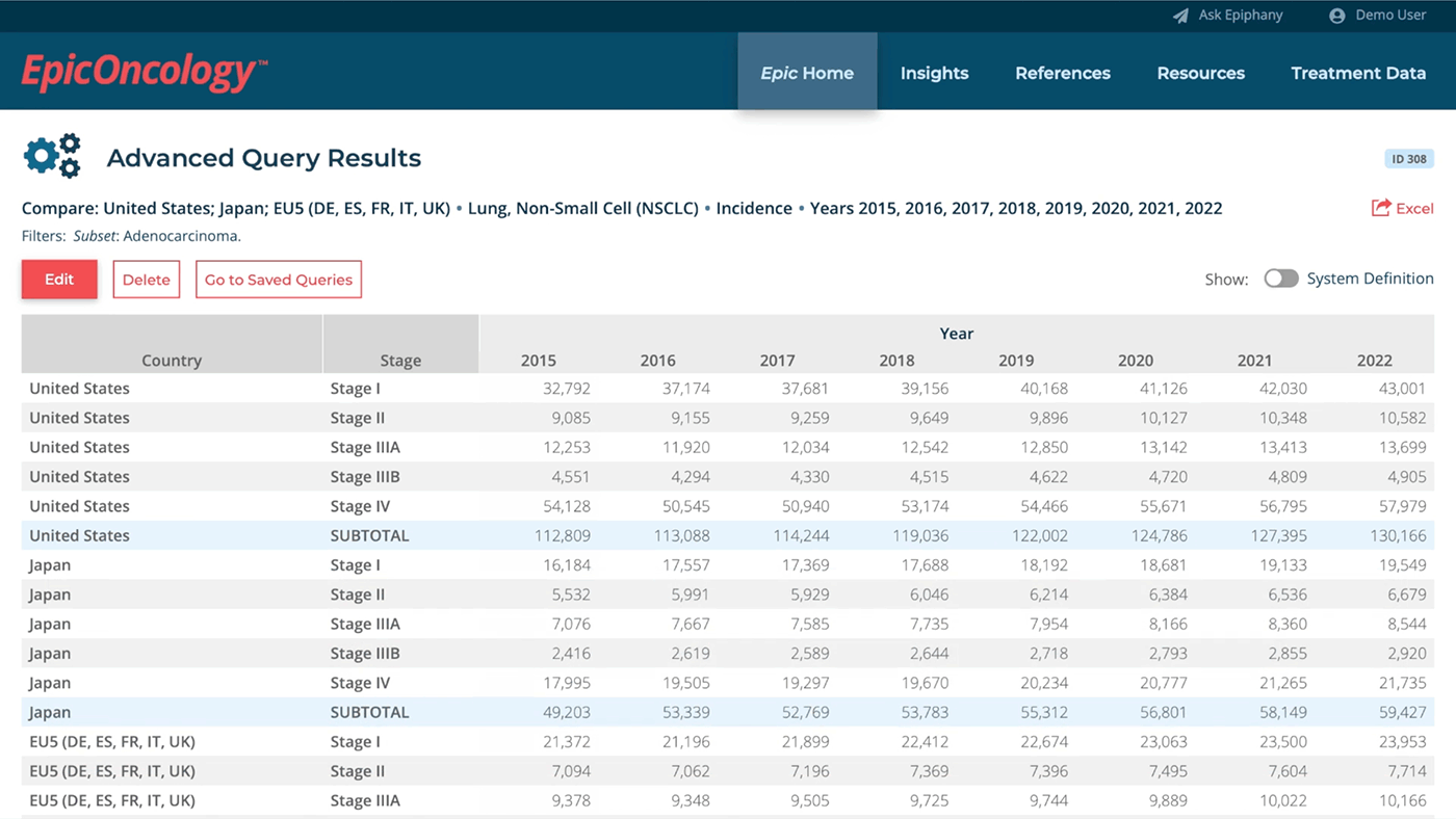
Customize the data output for any of the available variables by cancer type.
Use these powerful interactive graphs to deepen your understanding of our data sets through additional context. Each graph give you a 3-dimensional “starting point” – for instance, the Survival Curves graph shows estimates of survival by stage over a 10-year timeframe.
Then adjust the data to your liking, and harvest the detailed results. Epic Insights self-updates with each Analyses update, so these graphs always show you current information.
Component Trend graphs provide insight into historic and projected incidence, by comparing changes in incidence trends, the overall population growth, and demographic shifts due to aging populations.
These allow users to see the “actual” incidence growth trend for each cancer, separate from the impacts of population growth and demographics. In this example, the overall incidence growth for non-small cell lung cancer in the United States has decreased over time, similar to age-adjusted trends reported in the literature.
We see similar declines in incidence trends for colorectal cancers. The overall reported incidence for these cancers is growing, with the declining incidence trend overcome by population growth, and, most importantly, shifts towards older age groups (demographic changes).
Survival Curve graphs estimate survival by stage, to show the differences in survival over the 10-year timeframe. The graph renders data by year, though Epiphany’s syndicated models keep “future” survival stable.
These graphs allow users to compare the actual applied survival data across stages for ALL study cancers. The graph for non-small cell lung cancer in the United States shows that locoregional (Stages II and Stage IIIA) patients have similar survival rates, with Stage I having significantly higher survival. Survival for Stages IIIB and IV are also similar, showing the negative survival impact of either advanced nodal disease (Stage IIIB) or metastases (Stage IV).
Recurrence Curve graphs display first-course recurrence by stage to show the CUMULATIVE rate of recurrence over a 10-year window. This is a great starting point if you work on especially virulent cancer types.
This graph displays recurrence curves by stage for non-small cell lung cancer. It illustrates that in Epiphany’s models, the majority of recurrent patients are seen in the first three (3) to five (5) years, with the curves flattening out after then. The relative rate of recurrence is usually higher in later stages, but in this cancer, Stages III and IV have almost overlapping recurrence rates (with the same recurrence for all Stage III subtypes). Stage I and Stage II have fair separation in their recurrence curves, similar to what we see in the survival curves.
Country Population estimates (disease independent!) are available for all EpicOncology study countries. Data is available by gender and 5-year age groups.
Understanding the demographic changes in the country populations helps show the impacts of population growth and age shifting on incidence population (as shown in Component Trend graphs). As the graph for the United States illustrates, younger patients have very little demographic or growth shifts (Under 20, 20 to 34, and 35 to 49). However, larger growth trends and shifts exist in older age groups (50 to 64), but show more pronounced in the 60 to 79 and 80 and over age groups.
Trends vary by country and also by gender. These types of graphs allow users to better understand how the changes in populations may impact future incidence estimates.
Want to learn more about the data? Our References Section helps users understand the foundation of Epiphany’s data. Highlights include:
Data Sources
Understanding the data sources that power EpicOncology is crucial. This section provides a detailed overview of the primary data sources used to construct and populate the Epic data for each country.
Definitions
Definitions for terms and details on how to interpret the data shown in analysis tables as well as links to definitions and disease-specific information for all study cancers.
Methodology
A detailed methodology overview designed to provide an in-depth understanding of the model process and specific methods and approaches used in EpicOncology.
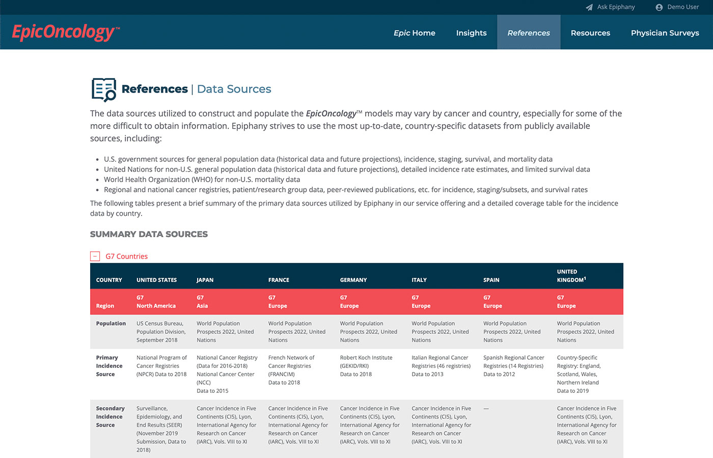
These tables provide a breakdown, for each country, of the data sources that inform EpicOncology. Key details include the populations studied, primary and secondary data, survival factors, and histology distributions.
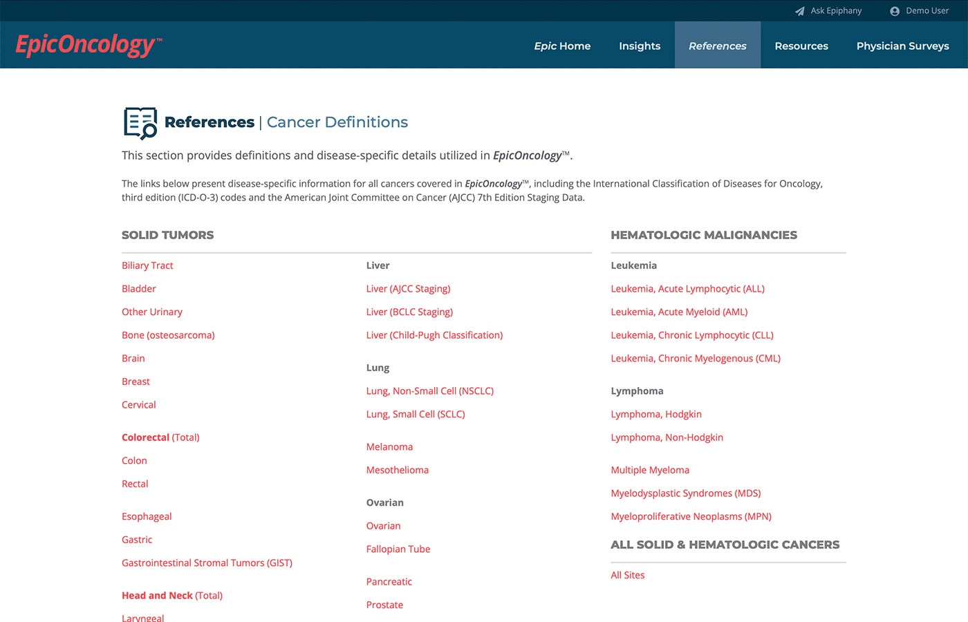
This section provides detailed definitions for all cancer types covered in Epic, including ICD-O-3 codes and AJCC 7th Edition staging data. This ensures accurate targeting and understanding of the cancers included in our analyses.
Epic‘s Physician Surveys provide real-world insights into cancer treatment. Our data includes:
Learn the key modalities and drug categories for current treatment options. Collect data direct from each cancer survey. Add to your global understanding of cancer treatment.
Epic gives you the tools to see into the future of cancer treatment. All data backed up by Epiphany’s trust-first approach.